
Responsive Tailwindcss Grid with Auto-Fit and Auto-Fill
Learn to create responsive tailwind grids using autofit and autofill with code examples. Build CSS grid and masonry layout using this guide.
December 10, 2024 • 3 min read • TailwindCSSCSS
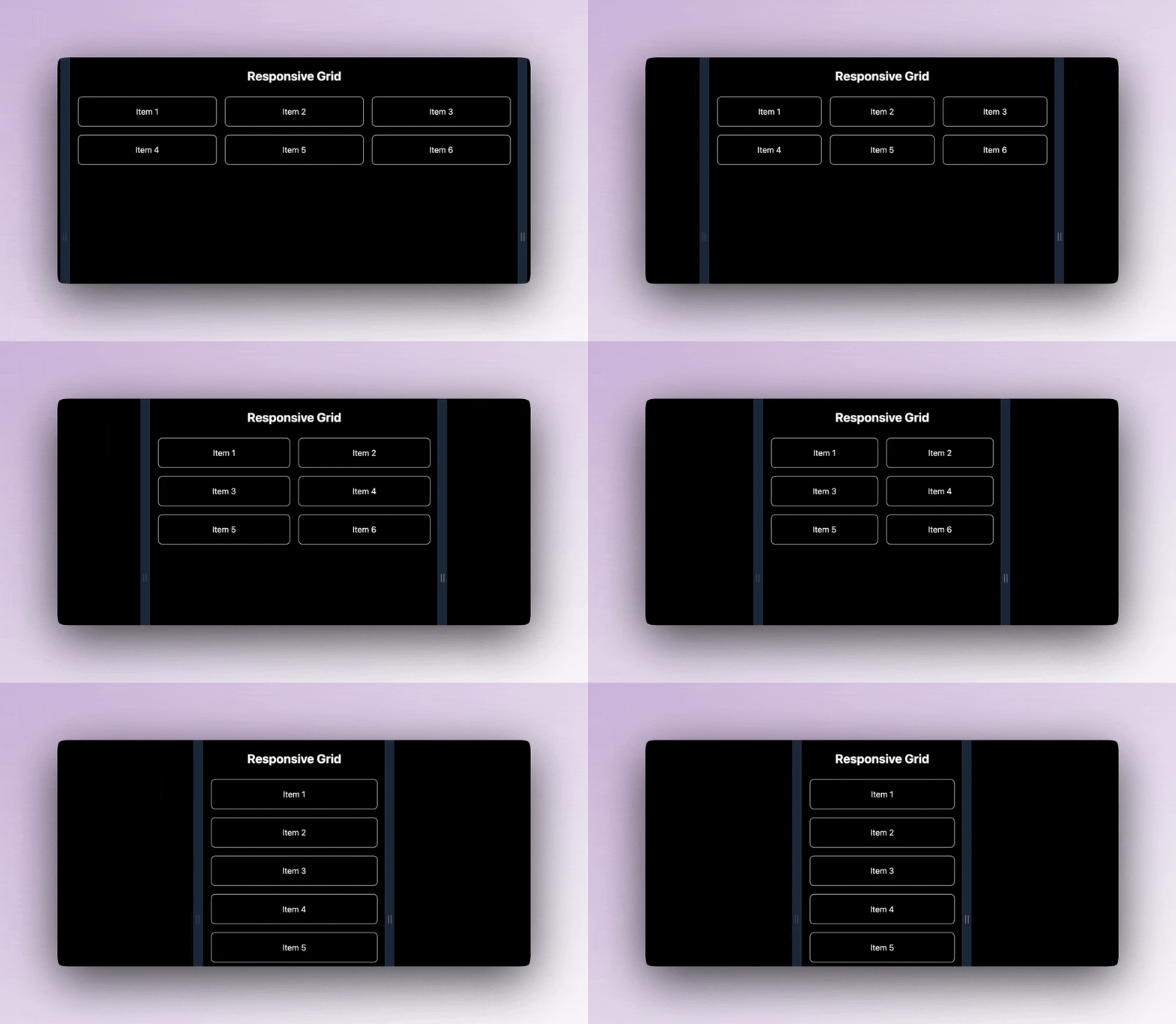
In this post, I'll show you how to create responsive grids using TailwindCSS with auto-fit and auto-fill. These two powerful CSS Grid features allow your grids to adapt dynamically to their container size, making them perfect for responsive layouts.
TLDR; Entire code is available here: play.tailwindcss.com/ZkQemrksvh
Getting Started
To create responsive grids with auto-fit and auto-fill in TailwindCSS, you need to:
- Understand the difference between
auto-fitandauto-fill. - Write the HTML and TailwindCSS classes for your grid.
- Customize your Tailwind configuration to achieve the desired behavior (if needed).
What are auto-fit and auto-fill?
- Auto-Fit: Compresses grid items to fit the available space, leaving empty cells as necessary.
- Auto-Fill: Maintains consistent grid tracks, filling all possible slots, even if they are empty.
Let’s dive into the implementation.
HTML and TailwindCSS Code
Here’s a responsive grid example that dynamically adjusts the number of columns based on the container size using grid-cols-[repeat(auto-fit,_minmax(200px,_1fr))].
<section class="py-8 bg-black text-white">
  <h2 class="text-center text-2xl font-bold mb-6">Responsive Grid</h2>
  <div class="grid grid-cols-[repeat(auto-fit,_minmax(200px,_1fr))] gap-4 px-4">
    <div class="bg-blue-500 p-4 text-center rounded shadow">Item 1</div>
    <div class="bg-blue-500 p-4 text-center rounded shadow">Item 2</div>
    <div class="bg-blue-500 p-4 text-center rounded shadow">Item 3</div>
    <div class="bg-blue-500 p-4 text-center rounded shadow">Item 4</div>
    <div class="bg-blue-500 p-4 text-center rounded shadow">Item 5</div>
    <div class="bg-blue-500 p-4 text-center rounded shadow">Item 6</div>
  </div>
</section>
Key TailwindCSS Classes Used
grid: Applies the CSS Grid layout.grid-cols-[repeat(auto-fit,_minmax(200px,_1fr))]: Dynamically defines the number of columns based on available space.gap-4: Adds spacing between grid items.
Auto-Fill Example
If you want consistent column behavior, even if some slots are empty, you can use auto-fill instead of auto-fit.
<div class="grid grid-cols-[repeat(auto-fill,_minmax(200px,_1fr))] gap-4">
  <!-- Add items here -->
</div>
Bonus: Tailwind Config Customization
Although TailwindCSS supports most grid functionalities out of the box, you can extend the default theme for more flexibility.
/** @type {import('tailwindcss').Config} */
export default {
  theme: {
    extend: {
      gridTemplateColumns: {
        autofit: 'repeat(auto-fit, minmax(200px, 1fr))',
        autofill: 'repeat(auto-fill, minmax(200px, 1fr))',
      },
    },
  },
  plugins: [],
};
Now, you can use custom classes like grid-cols-autofit and grid-cols-autofill for brevity:
<div class="grid grid-cols-autofit gap-6">
  <!-- Items -->
</div>
Practical Use Case
Here’s a practical example for a responsive photo gallery:
<section class="py-8">
  <h2 class="text-center text-2xl font-bold mb-4">Photo Gallery</h2>
  <div class="grid grid-cols-[repeat(auto-fit,_minmax(150px,_1fr))] gap-4">
    <img class="rounded shadow" src="/images/photo1.jpg" alt="Photo 1" />
    <img class="rounded shadow" src="/images/photo2.jpg" alt="Photo 2" />
    <img class="rounded shadow" src="/images/photo3.jpg" alt="Photo 3" />
    <img class="rounded shadow" src="/images/photo4.jpg" alt="Photo 4" />
  </div>
</section>
Conclusion
With just a few utility classes and configurations, you can create powerful, responsive grids in TailwindCSS. Whether you need adaptive layouts for photos, cards, or other content, auto-fit and auto-fill give you the flexibility to build stunning designs effortlessly.
If you want more tips and tutorials like this, subscribe to the UiBun newsletter below.