Tailwind Responsive Design- A Complete Guide
Learn how to build fully responsive websites with Tailwind CSS using its mobile-first approach and utility classes, with a detailed guide and practical code examples.
March 10, 2025 • 2 min read • TailwindcssCSS
Creating a responsive websites is essential for today's mobile first world. Tailwind CSS makes it incredibly easy to create responsive websites without writing complex css media queries.
TLDR; Entire code is available here: play.tailwindcss.com/kn6inAvRy2
You can also import this code block in the UiBun Visual Editor
Understanding Tailwind's responsive Design system
Tailwind follows mobile first approach means styles are applied first to smaller screens and then adjusted for larger screens using responsive prefix.
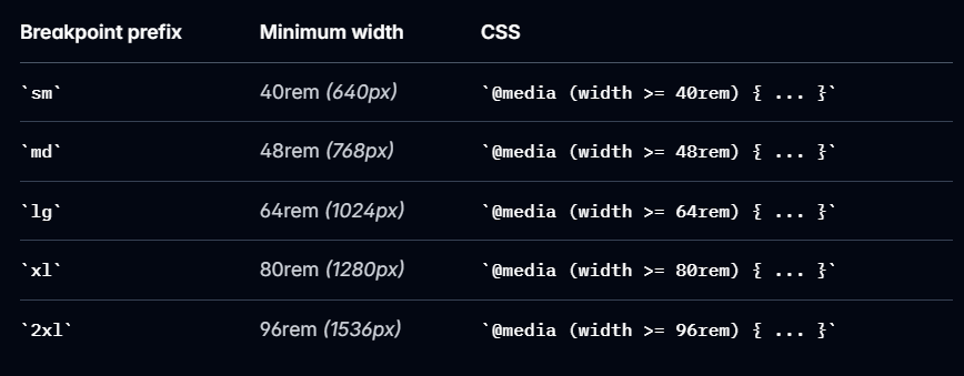
Default Breakpoints in Tailwind CSS
Tailwind provides the following default breakpoints:
Now, let's understand how to use these tailwind utilities to create a responsive design.
How to Use Responsive Utilities
Tailwind uses prefix-based syntax to apply styles for different screen size. The general syntex is as below.
<p class="text-sm md:text-lg lg:text-xl">Responsive text size</p>
text-sm: Applies on all screen sizes.md:text-lg: Applies when screen width is 768px or more.lg:text-xl: Applies when screen width is 1024px or more.
Now let understand it with example.
Responsive Grid Layout Example
You can create responsive grid layout using tailwind as below.
<div class="grid grid-cols-1 md:grid-cols-2 lg:grid-cols-3 gap-4">
  <div class="bg-blue-500 p-4">Box 1</div>
  <div class="bg-green-500 p-4">Box 2</div>
  <div class="bg-red-500 p-4">Box 3</div>
</div>

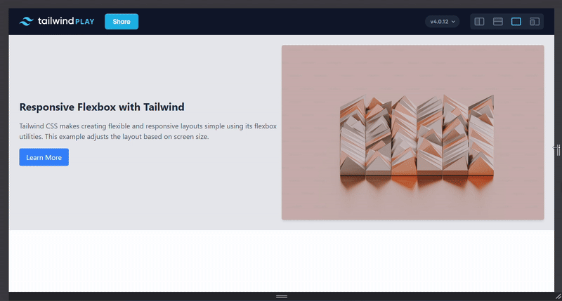
Responsive Flex Layout Example
Let's create responsive Hero section using tailwind's flex utilities
<div class="flex flex-col md:flex-row items-center md:justify-between p-6 bg-gray-200">
  <!-- Left Section -->
  <div class="flex flex-col items-center md:items-start md:w-1/2 space-y-4">
    <h2 class="text-lg md:text-2xl font-bold text-gray-800">Responsive Flexbox with Tailwind</h2>
    <p class="text-sm md:text-base text-gray-600">Tailwind CSS makes creating flexible and responsive layouts simple using its flexbox utilities. This example adjusts the layout based on screen size.</p>
    <a href="#" class="bg-blue-500 text-white px-4 py-2 rounded hover:bg-blue-700">Learn More</a>
  </div>

  <!-- Right Section (Image or Content) -->
  <div class="mt-6 md:mt-0 md:w-1/2">
    <img src="https://via.placeholder.com/400" alt="Example Image" class="w-full md:w-auto rounded shadow-md">
  </div>
</div>
Tailwind CSS makes building responsive, mobile-friendly websites incredibly easy. You can create flexible layouts without writing custom media queries. Start using Tailwind today to speed up development and create stunning, adaptive web experiences!